The Brief
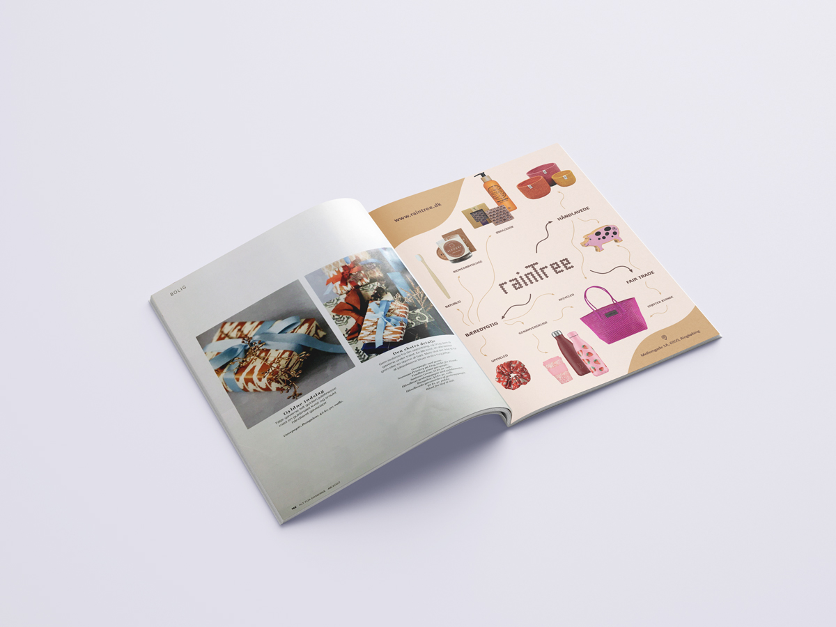
Design of an advertisement for RainTree to be printed on Alt for Damerne magazine in Denmark during 2020 Christmas shopping period. The design was expected to be informative and attractive to boost sales and increase recognition, as well as to follow the magazine’s guidelines.
constraints: informative, attractive
The Design
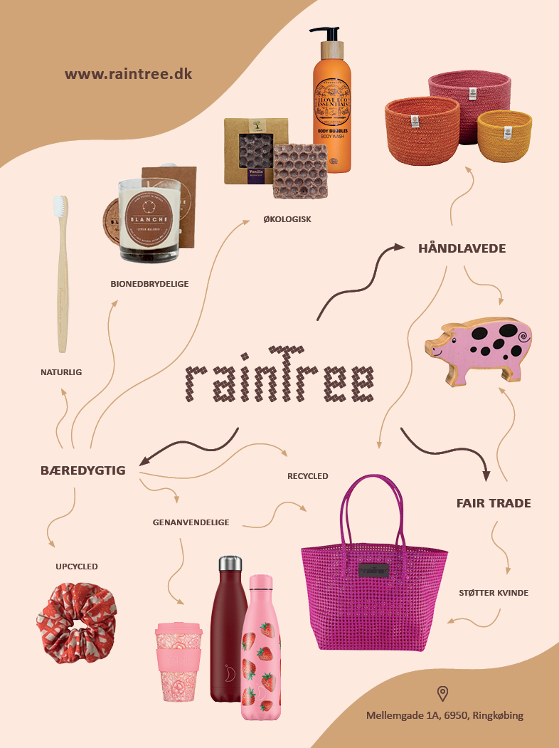
The design successfully communicates RainTree’s vision through the brand’s characteristics and the product examples corresponding to these characteristics.
keywords: attractive, brand’s vision, brand’s product selection
The Design Process
We followed a Double Diamond design process: discover, define, develop, deliver.
In the discovery stage, we looked at RainTree‘s product selection and wrote down their characteristics. We also, looked at Alt for Damerne magazine to understand its identity and its audience.
In the define stage, we created mind maps based on our discovery stage for both brands, RainTree and Alt for Damerne, to understand what the common ground in this collaboration.
In the develop stage, we created 5 design concepts first as hand sketches, then through computer software. We had long discussions about the concepts and iterated on the designs. We followed up by presenting to the client and asked her to choose an alternative and provide feedback.
Based on client’s wishes and further critique within our team, we finalized the design complying with the magazine’s guidelines.
The video on the right briefly presents our process.
The Final Design
RainTree is not just another company and brand. It has three main characteristics as fair trade, handmade, and sustainability. First of all, it is a fair trade certified brand supporting fair trade projects around the globe through resell agreements. Moreover, its own product line and selection are handmade, thus, it supports craftspeople around the world. In addition to these, it is committed to and contributes to sustainability. Again, its own product line and also selection are partly or fully made out of sustainable materials, either as recycled materials or fast growing natural materials. Moreover, the products support and promote a sustainable way of living with its emphasis on reusable items.
With our design, we wanted to put forward these characteristics because it makes the brand stand out. Moreover, Alt for Damerne magazine and its audience are interested in slow and sustainable living. We also wanted to show the wide selection of products that they could find at RainTree shop.
In our design, we placed the RainTree logo at the center and drew organic arrows pointing to these three characteristics as fair trade, handmade (håndlavede), and sustainable (bæredygtig). From these key concepts, we drew out more arrows pointing to related sub-concepts such as supporting women (støtter kvinde), reusable (genanvendelige), recycled, upcycled, natural (naturlig), biodegradable (bionedbrydelige), ecologic (økologisk). For each sub-concept we put product examples. We finished the design with website and location information on the cross corners of the page. We preferred to use RainTree‘s color scheme of two shades of brown, and complemented it with background color and imagery based on natural as well as pink tones.

Explore Our Other Work for RainTree
We have been collaborating with RainTree since 2014. It has been one of the best client relationships we have had both in terms of body of work and also the peaceful collaboration! It started with Şeyda discovering the brand while looking for products for our pop-up shop. We started reselling fair trade RainTree bags. We then started offering design consultancy service to RainTree. We redesigned their visual identity such as logotype, bag labels, hang tags, and catalogs. Afterwards, we designed the product identity of RainTree‘s “DIY Retro Hanger Kits”. Over the years, we have redesigned some of their visual materials as needed.
Explore these other works we did for RainTree through the following pages.
Resources: Thanks to Mockups-Design.com for the editable magazine mock-up file.


