visual identity design
The Brief
Redesign of RainTree’s visual identity, label design to be attached to RainTree bags, information tags, and catalog.
constraints: economy, time, sustainability
The Design
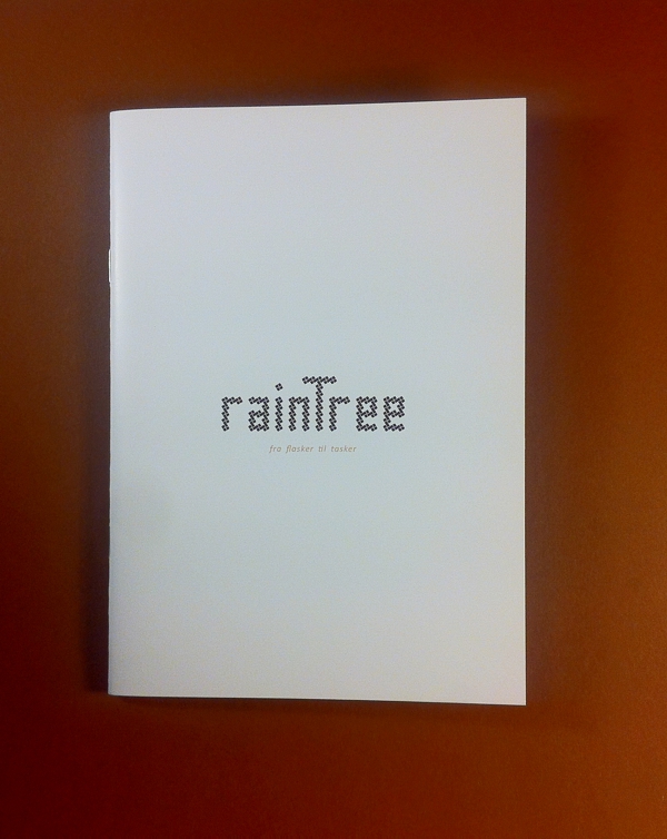
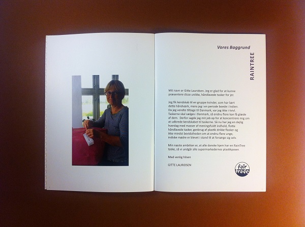
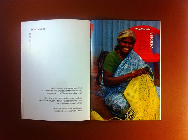
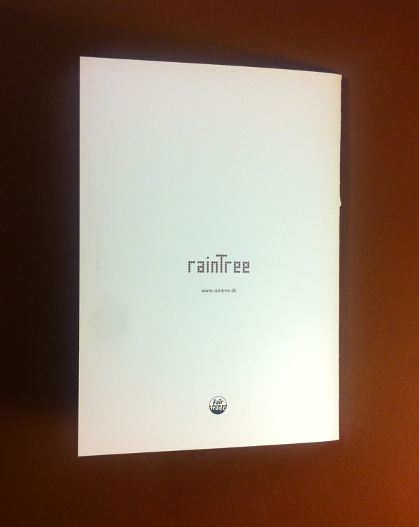
The new visual identity for RainTree makes a direct reference to RainTree products. The logotype is a minimal interpretation of the knotting structure of the bags. The information tags and catalogs make an emphasis on telling the RainTree’s story and essence.
keywords: minimal, coherent, informative, economic
Logotype
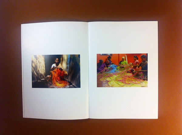
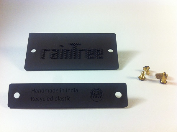
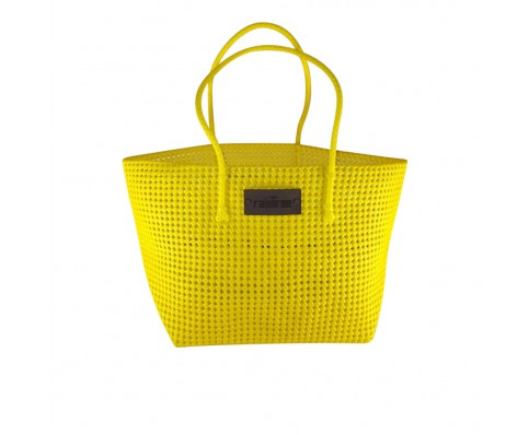
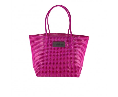
The knotting technique of RainTree bags is so significant and shapes the product. It creates not only a beautiful pattern but also a strong structure. Moreover, it reflects the women and culture. With this technique, the product follows a complete non-industrial thus very sustainable production.
Thus, the identity tries to imitate the knotting structure of the RainTree bags. It uses the knots to create a typography. It aims to own this technique and look.

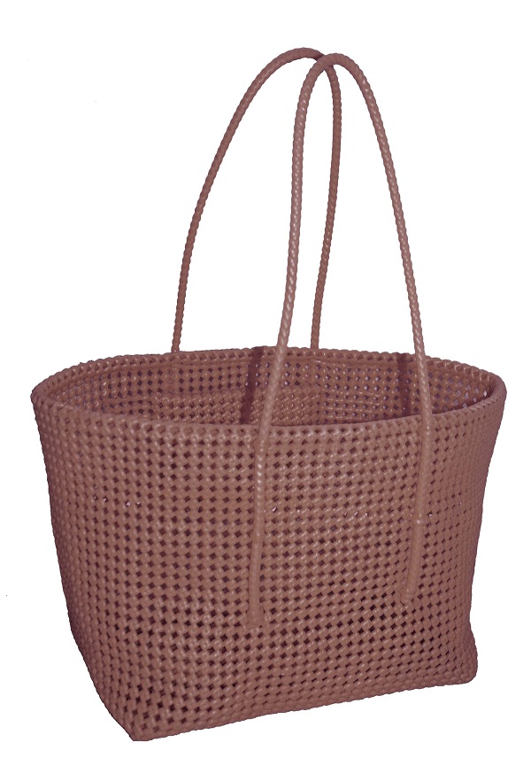

Label
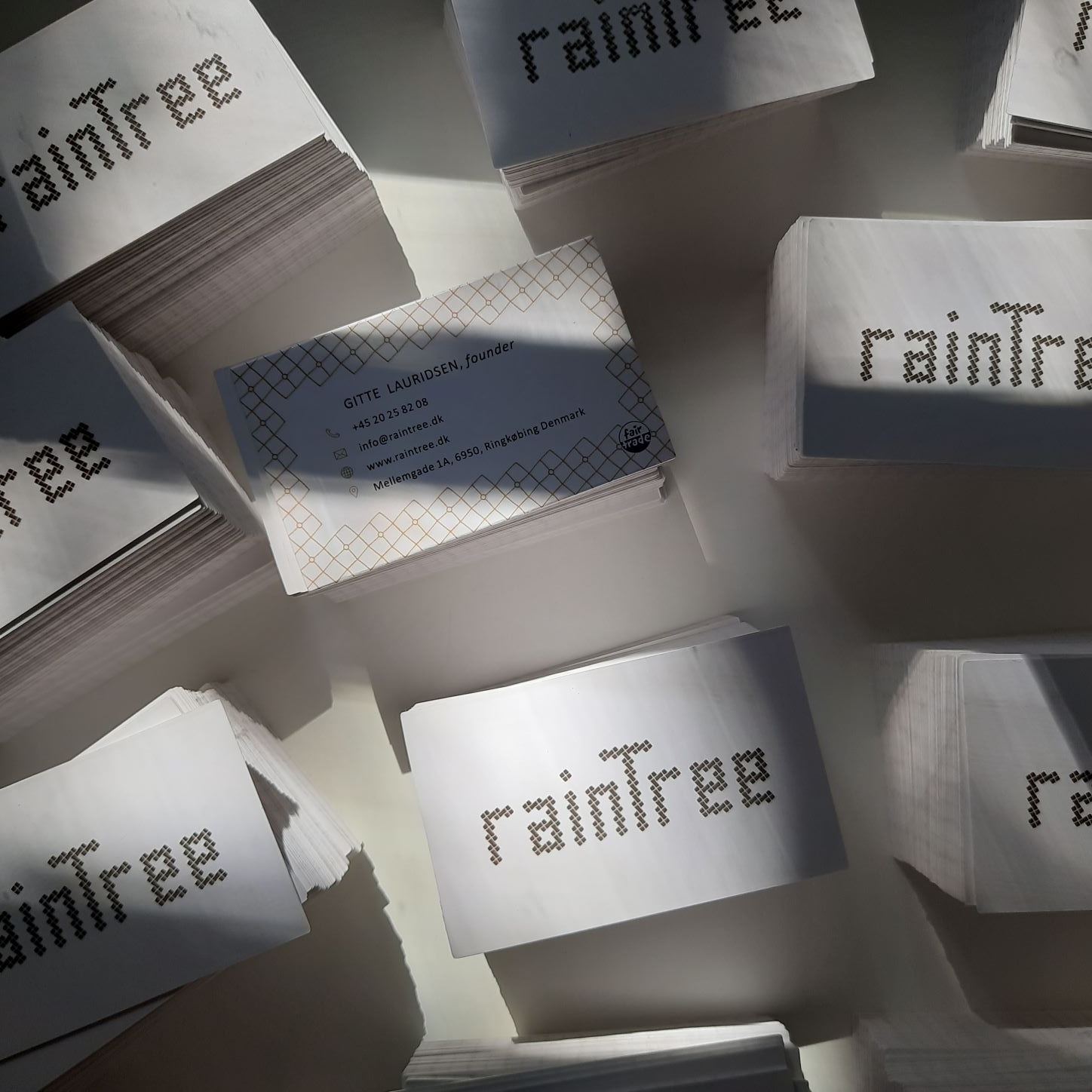
Business Cards
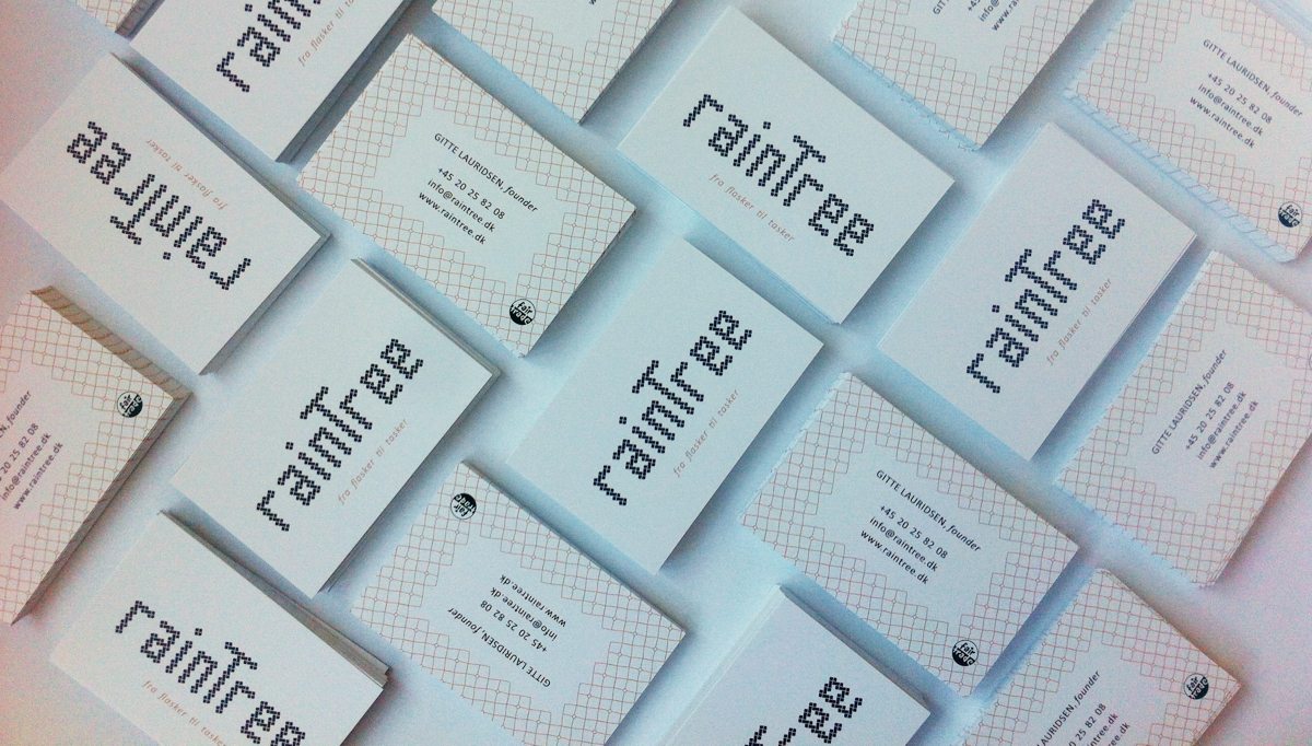
Business Cards Update in 2020
We redesigned the business cards in 2020 by adding address information, editing icons and finalizing with a lacquer finish on a higher quality paper adding a more exclusive look.
Information Tags
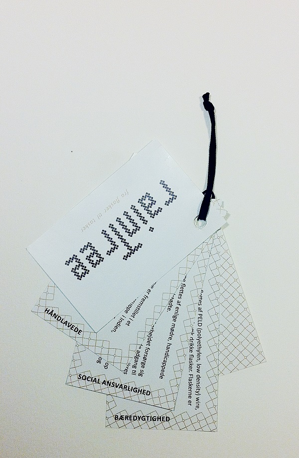
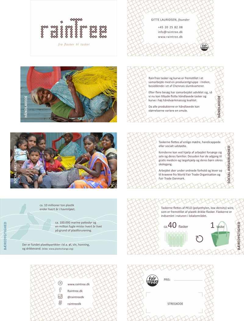
Information Tag Edit in 2020
Due to some changes in the information regarding the material composition, RainTree asked us to redesign the hang tags with a new illustration.

Sliders for the Website
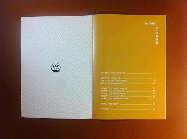
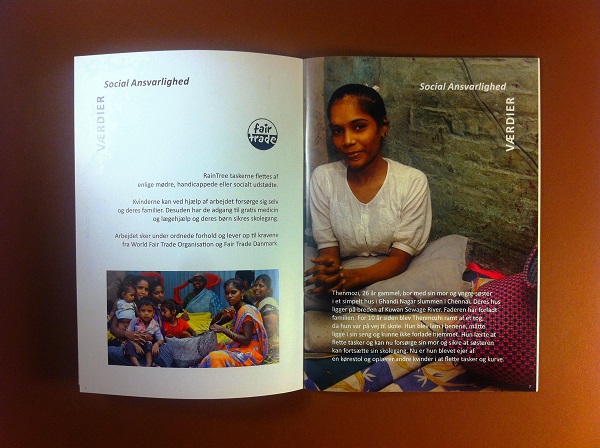
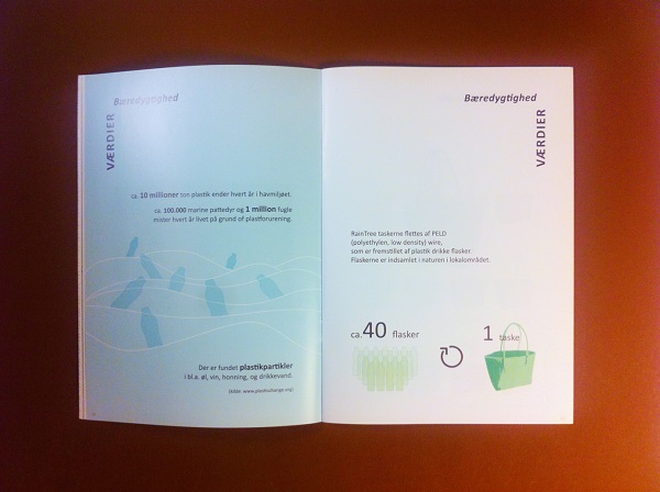
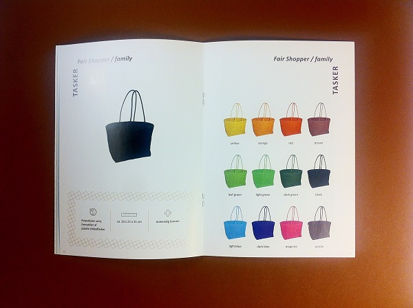
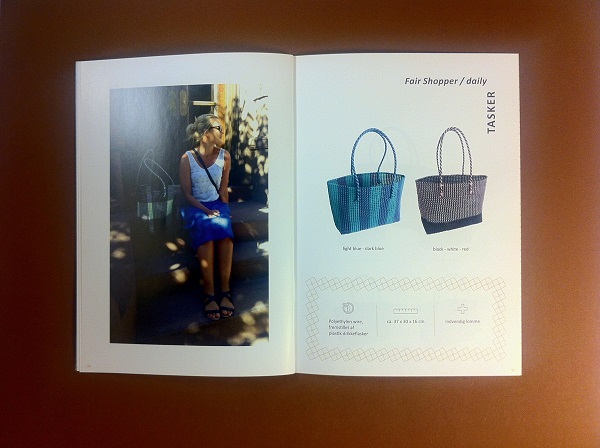
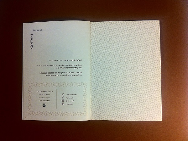
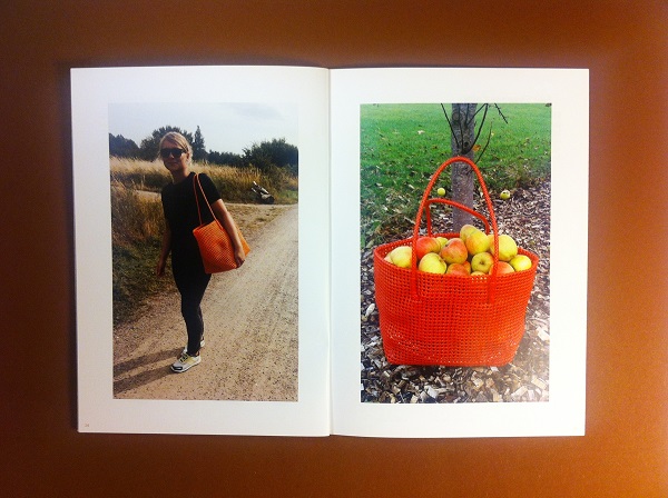
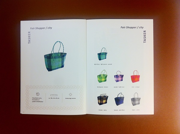
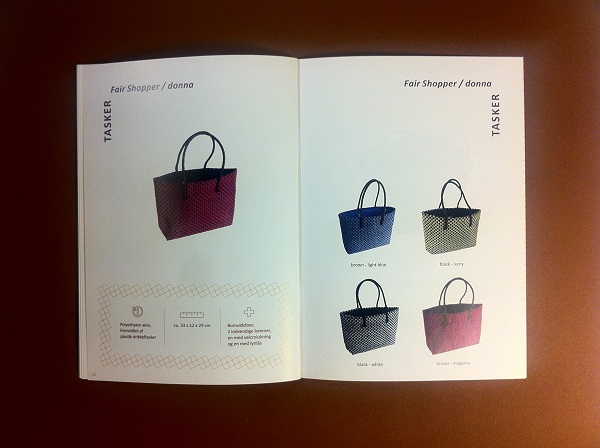
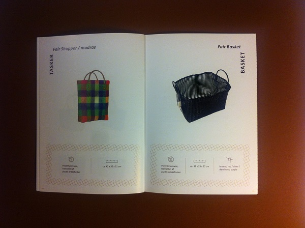
Catalog
