Loading cart contents...

visual identity design
The Brief
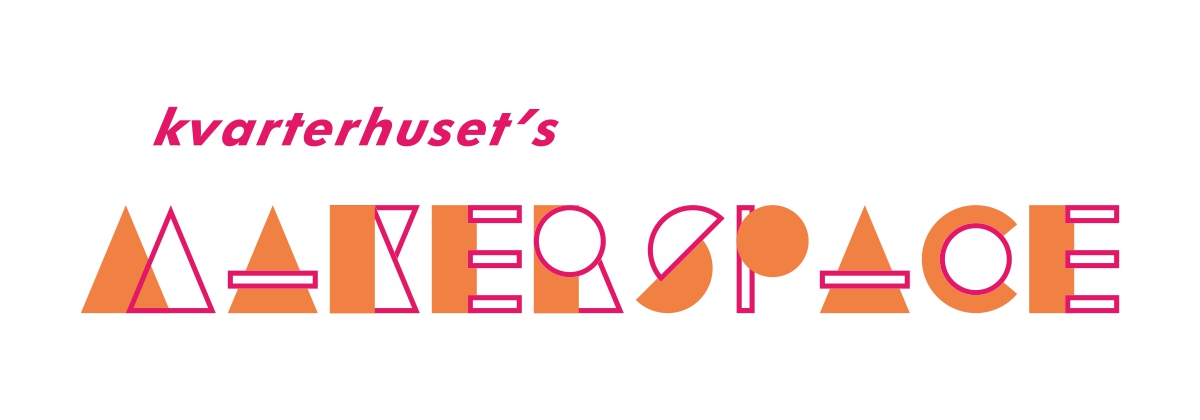
Design of visual identity as logotype and event poster / flyers for Kvarterhuset’s Makerspace.
keywords: context
The Design
The logotype takes its essence from the maker culture that is about working with different materials, shapes and technology with a creative mindset. The design is based on an alphabet of basic shapes as square, circle, triangle and rectangle. Each letter is constructed by combining the relevant shapes. Orange and pink color scheme is chosen due to their energetic, stimulating nature.
keywords: playful, dynamic, relevance to context
The Logotype

Event Posters & Social Media Images


