The Brief
Design of website, social media images and roll-up for CPH POW-Power of Women Festival Copenhagen.
constraints: economy, time, informative, attractive, professional
The Design
The design brings a professional, coherent, and attractive look, feel, and use.
keywords: strong, usable, clear, coherent
Website Design
Background: CPH POW Festival approached us with a visual identity designed by Askvig-Stitz and requested that we design the website based on this visual identity in terms of style, color-scheme, typography. The festival has shot one main campaign image and requested that it is used on the website’s landing page as well as in main communication mediums like Facebook cover. Other than this, the festival has not provided a written brief or any content. Only the titles of the pages were discussed. We had only 1 month to finish the project. The content was provided in only 2 days before the website was published.
All visual design, information architecture, set up and updates were done by us.
In some cases we did copy-writing as well.
Home Page
We designed the home page as an attractive place giving quick overview of the festival. The first section gives an introduction, the second section gives an insight on the diverse character of the festival program by using images from the events cut in W (W for Women), the third section introduces how you can get a free ticket for one of the events.


About Page
We designed the about page as a long one page upon request providing information on many issues. Each section is differentiated from each other by using different colors. In addition to this, an icon representing each section is designed using elements from the visual identity in order to enhance the coherence and user experience.
Program Page
We aimed to give a readable overview of the program and venues on this page. Therefore we created a clear distinction in each day.
Each event is introduced with title, short introduction, time and venue. We used “-W” part of the logotype as a frame for each event picture.
In cases where the event did not have an original image, we used stock photo and designed an illustration to explain the essence of the event.


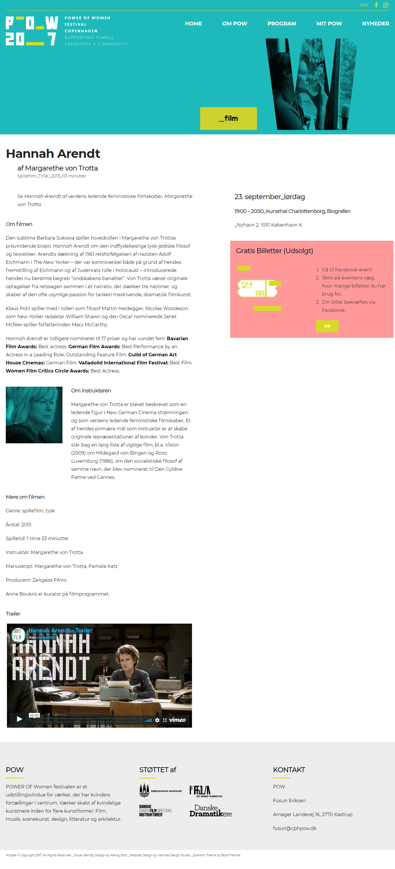
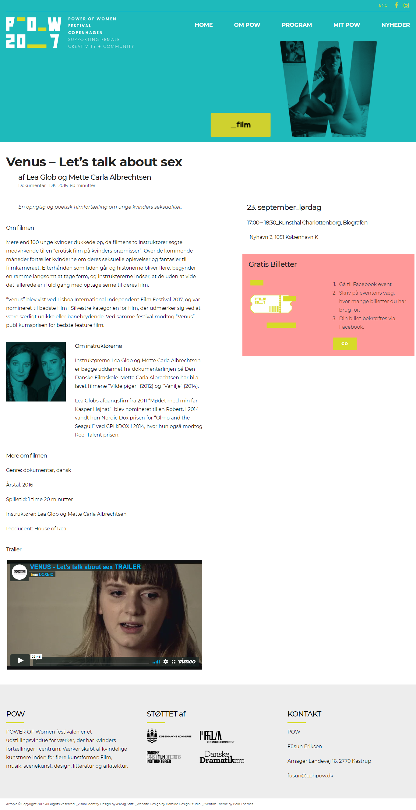
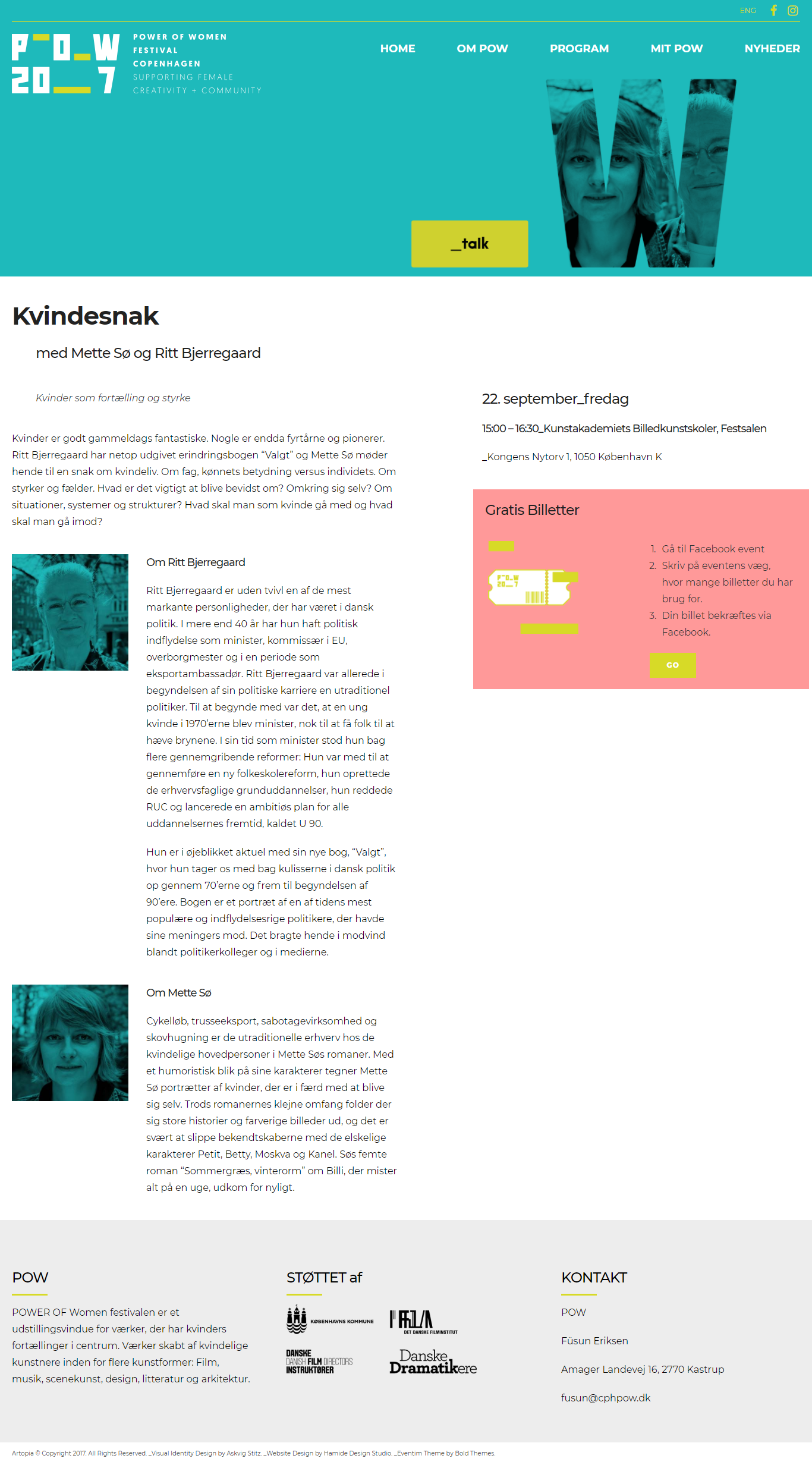
Event Page
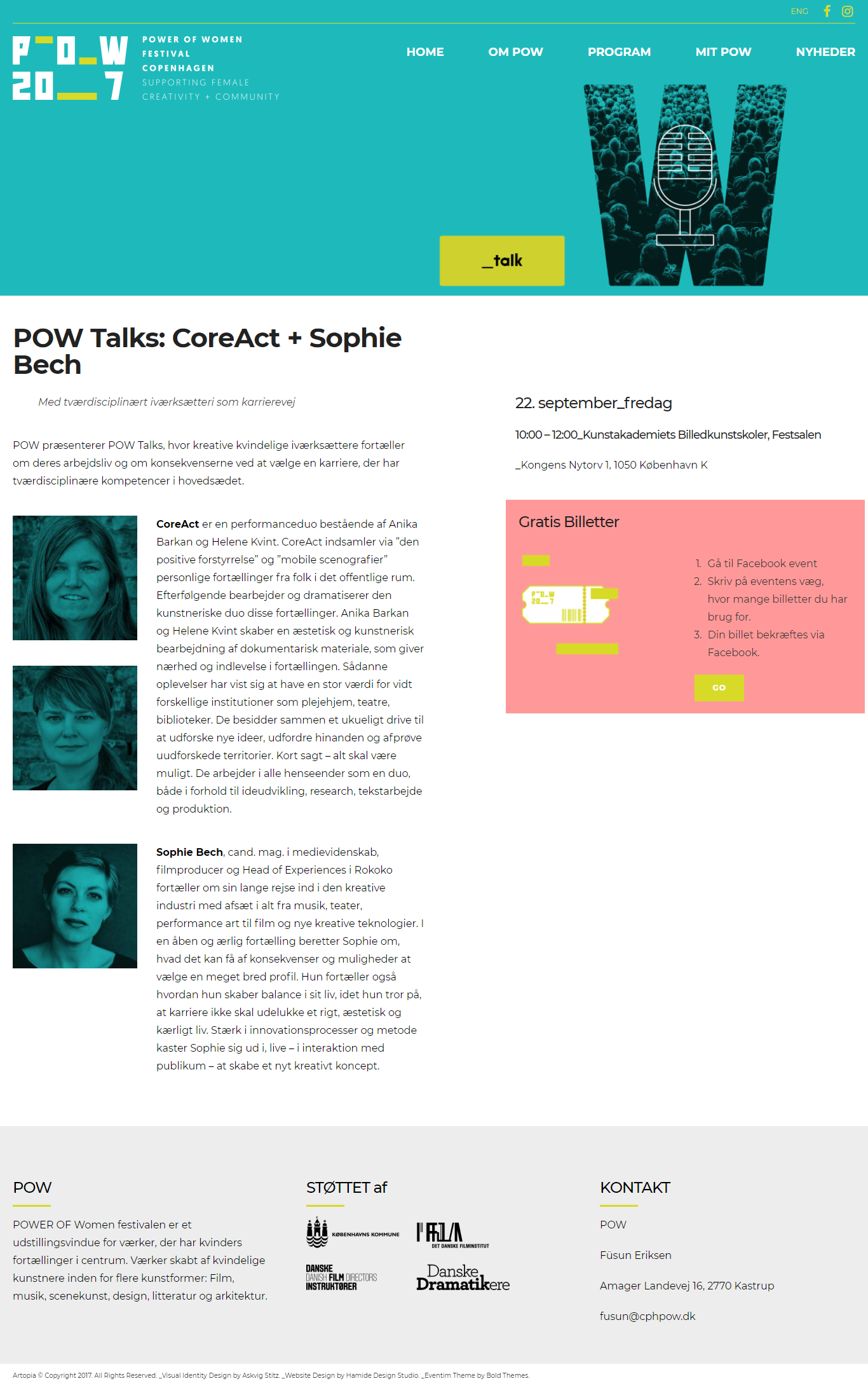
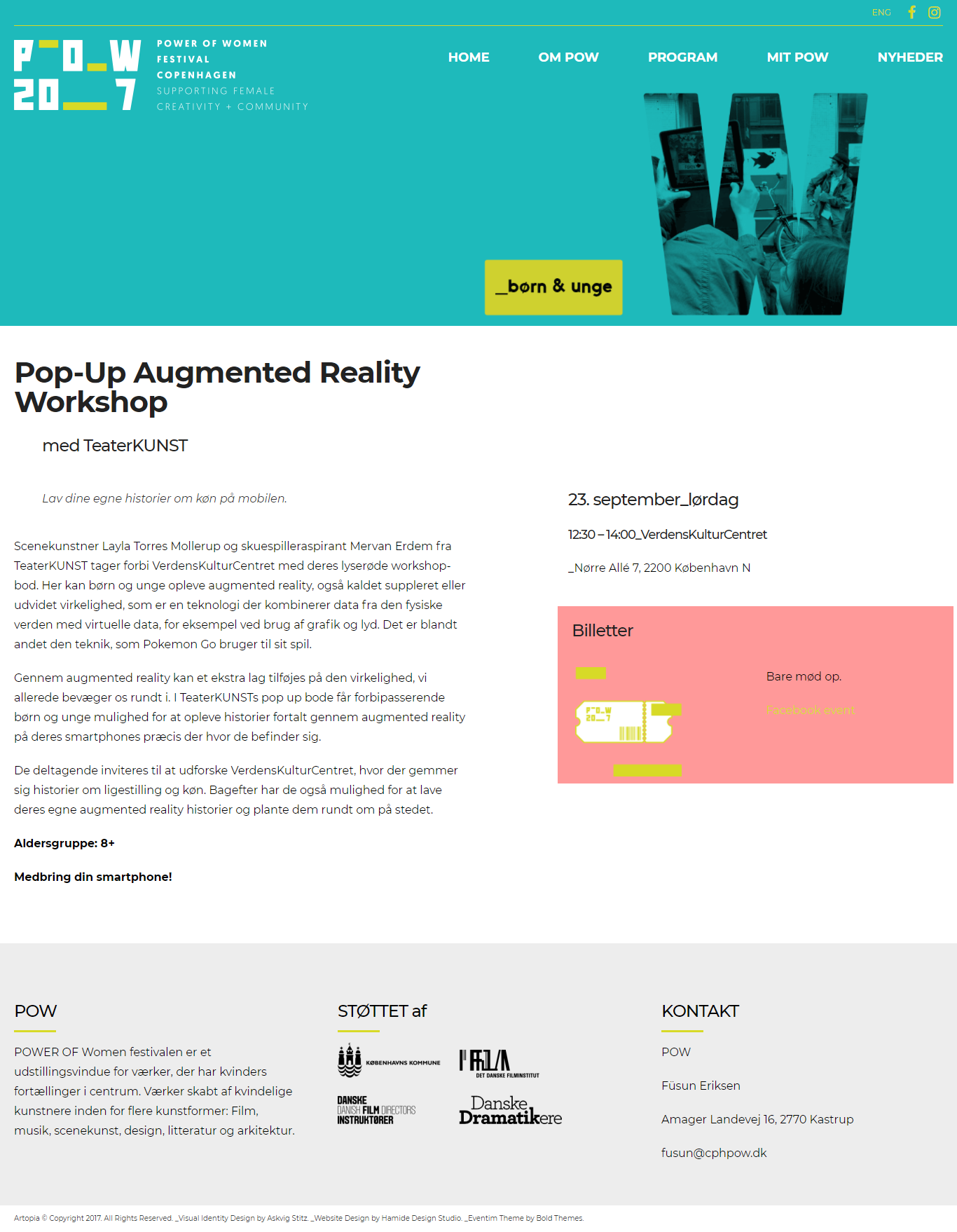
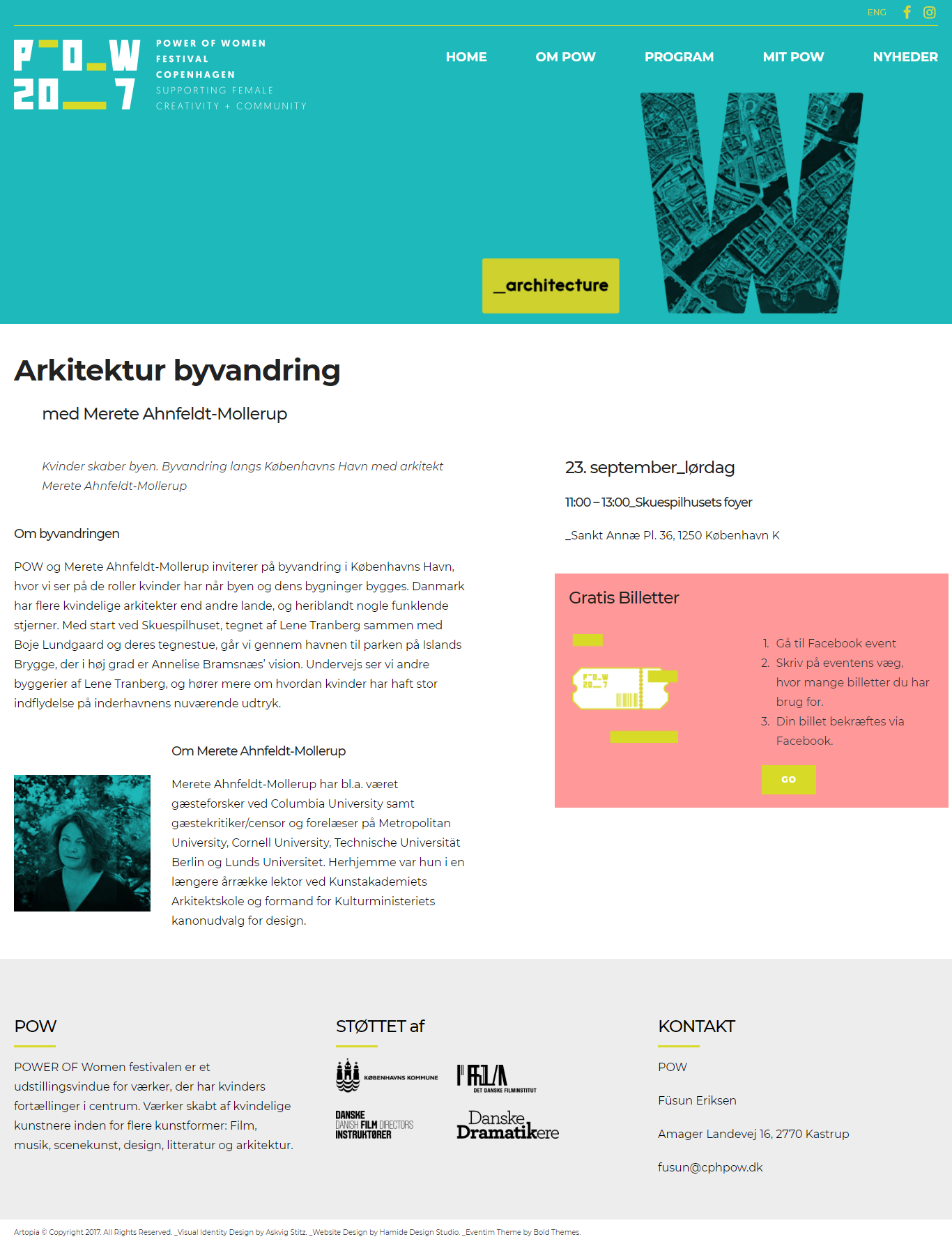
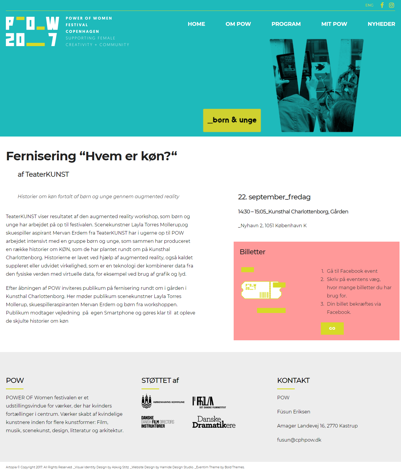
We divided the page into two main coloumns: Big one for main information, the smaller one for practical information.
Flip Through the Event Pages
“My POW” Page
This page is about interacting with the audience. It has a section showing social media feed from Facebook and Instagram. The other section is about getting feedback and ideas from the audience.


Press Page
This page is providing files to download to press as well as clippings from press coverage.
Deleted Pages
In addition to these, we designed “Blog” page and “Shop” page based on the requirements on the first meeting. However, the festival decided not to use these pages because they did not have human capacity to manage them.


Social Media Images
We have designed social media images both for Facebook page cover, Facebook event page covers and event images for instagram.
These are the two main cover images for Facebook page.


Roll-up
We designed a roll-up to be used at the events. We focused on coherence with the rest of the visual identity as well as the information design.


Photo credit: Pinar Lauridsen
